Into the Metro Archives

Publication

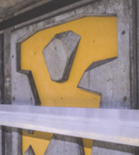
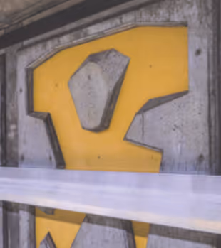
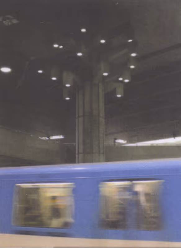
Since its opening in 1966, the Montreal Metro has become known not only as a transportation system, but also as a public art gallery woven throughout the city. Each station features its own unique architecture and integrated artworks, created by different artists and designers to reflect the identity and culture of its surrounding neighbourhood.

Close-up of a construction barrier with a yellow panel and concrete block behind white tape.
Beige file folder with papers and documents clipped by a silver paperclip against dark background.

The goal was to create a publication documenting the various artworks and installations found throughout the Montreal Metro stations while exploring the history of the metro system and its cultural significance.

Blue metro train passing through a dimly lit concrete subway station with overhead lights.

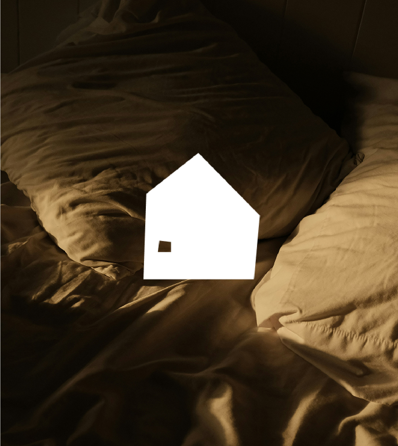
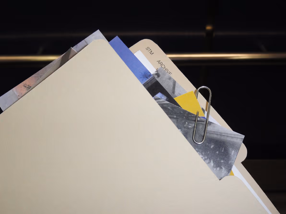
Since the STM has such a long history, I decided to take an archival approach to the project. It was important for me to create a piece that felt analog and handcrafted, reflecting the idea of uncovering and preserving collected records over time.

Open book spread featuring historical photos of metro construction, workers, officials, and early trains.
Timeline of STM metro history from 1863 to 2030 with milestone events and expansions detailed.
Open folder with left page blank white and right page translucent yellow labeled YELLOW with a tab STM ARCHIVE.
Open book spread featuring terra cotta murals with natural motifs and a photo of a stairway with terra cotta walls.
Open book showing cement block mural tiles with clay bas-reliefs by children, depicting city life and transport.
Open folder with left page blank white and right page translucent yellow labeled YELLOW with a tab STM ARCHIVE.
Open book showing text about Jean Dumontier and two photos of yellow and gray metro mural details.
Open book showing Montreal metro map, schedule, and an OPUS transit card on the right page.

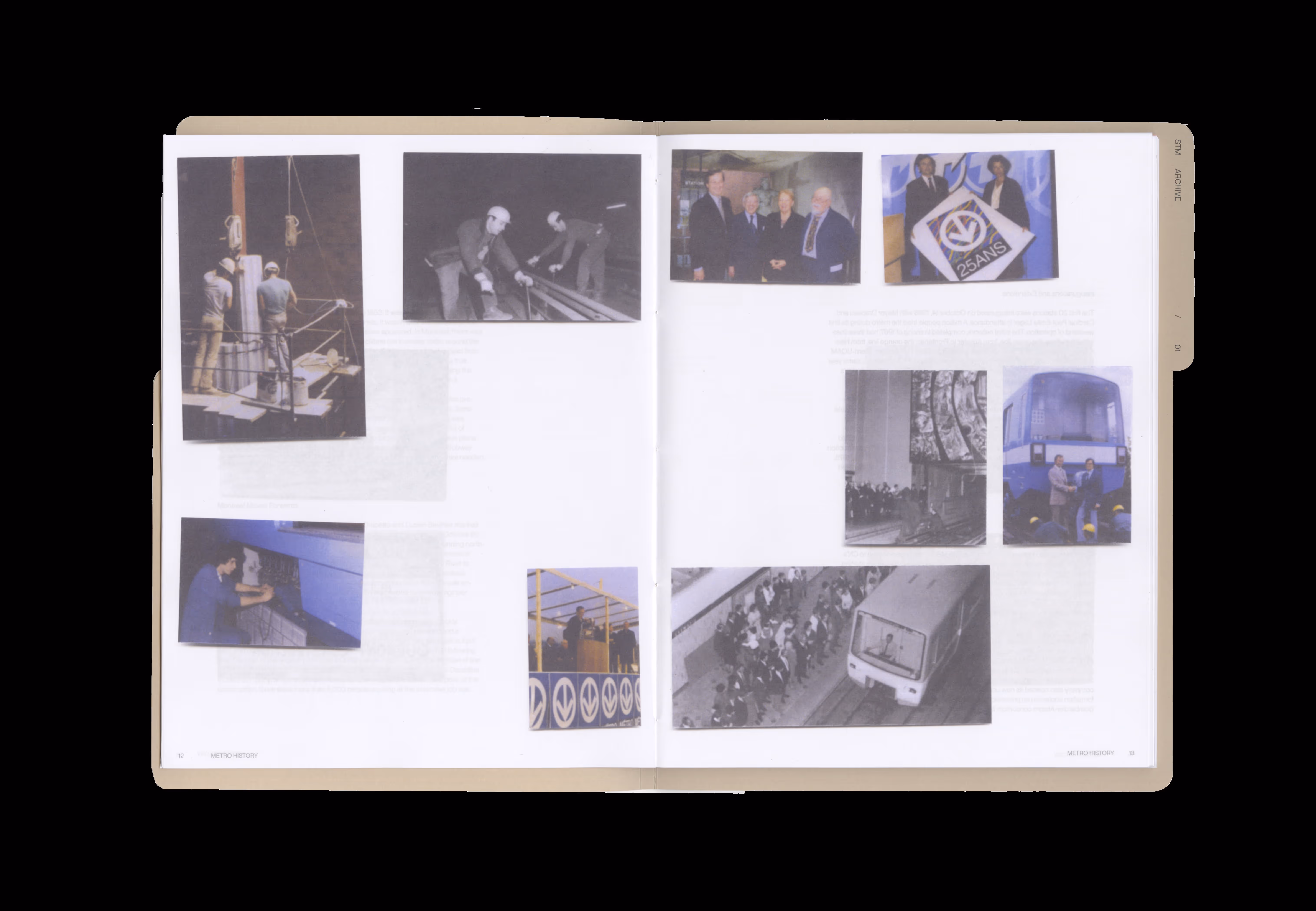
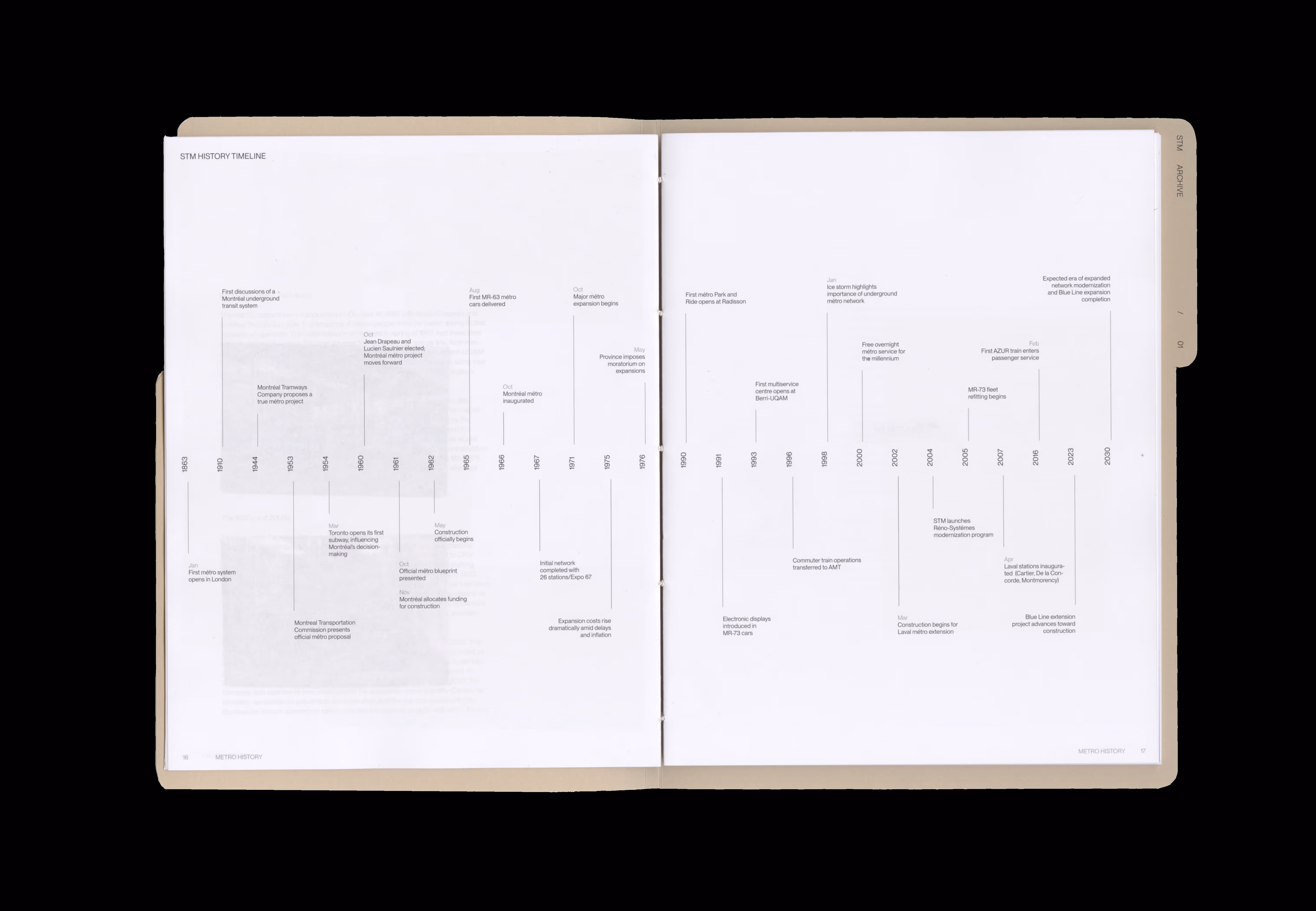
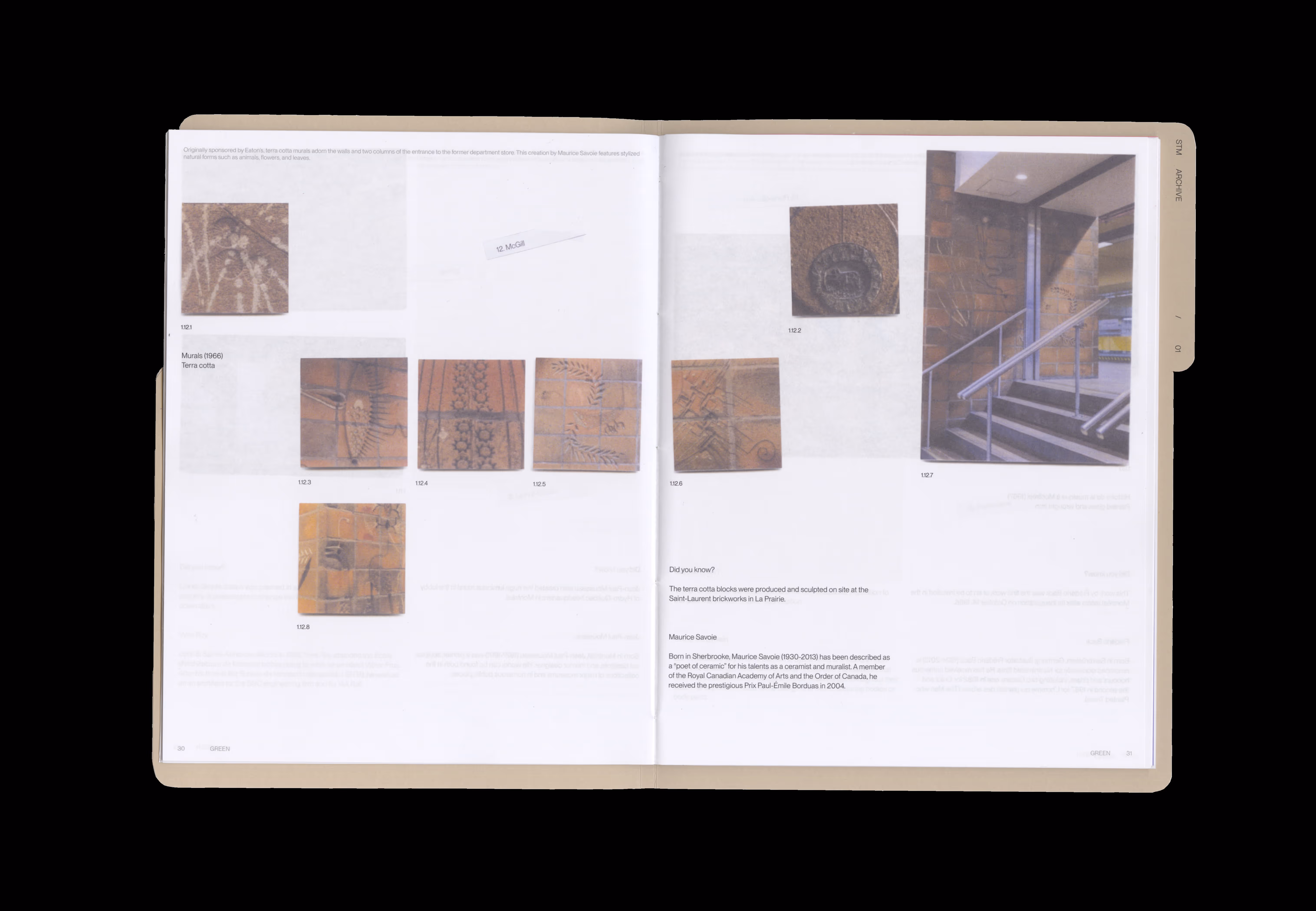
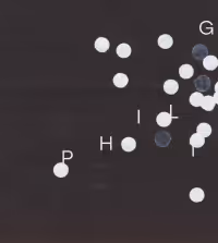
For all image treatments, I experimented with multiple scan treatments to give each image a grainy texture, further emphasizing the archival concept, as if they were part of a collected file system. The art pieces are identified using a numbering system that follows the order of each metro line and station. All station images are arranged in unique layout compositions to create a dynamic reading experience. Lastly, the cover and binding take on the appearance of a file folder, while the book block is coptic-bound to resemble a stack of filed papers.

Hand holding an open art catalog showing abstract paintings on a stone bench background.
go back up

credits

typeface
photography

PP Neue Montreal
Juliana Wu

works

Publication

White house icon projected onto rumpled brown bed sheets with soft lighting.

[ 02 ]

Be Tiny

Branding

Gradient background from peach to dark blue with white numbers 2 and 0 stacked vertically.

[ 03 ]

Interlude

Promotional

Light green book titled 'A Year in Tea' with a soft abstract cover design.

Publication

White right arrow made of rectangles on black background, with number 9 in upper left corner.

Wayfinding

White packaging boxes for Apivita body balms, one labeled 'Orange Coconut Menthe Sauvage'.

Packaging

Black background with scattered white dots and letters G, I, H, and P near dots.

Promotional