The goal was to design a poster that would represent the visual identity of Dawson's Graphic Design 2026 Vernissage for promotional use.
I wanted the meaning behind my poster to symbolize the time and dedication we, as graphic designers, spend creating and designing. I wanted it to resonate not only with students, but also with professionals in the field.
Interlude
Promotional
As we graduate from our final semester in graphic design, we have spent countless hours creating amazing projects ready to showcase to the world. Presented through a vernissage exhibition, this period in our lives represents a moment of transition and growth toward what comes next.
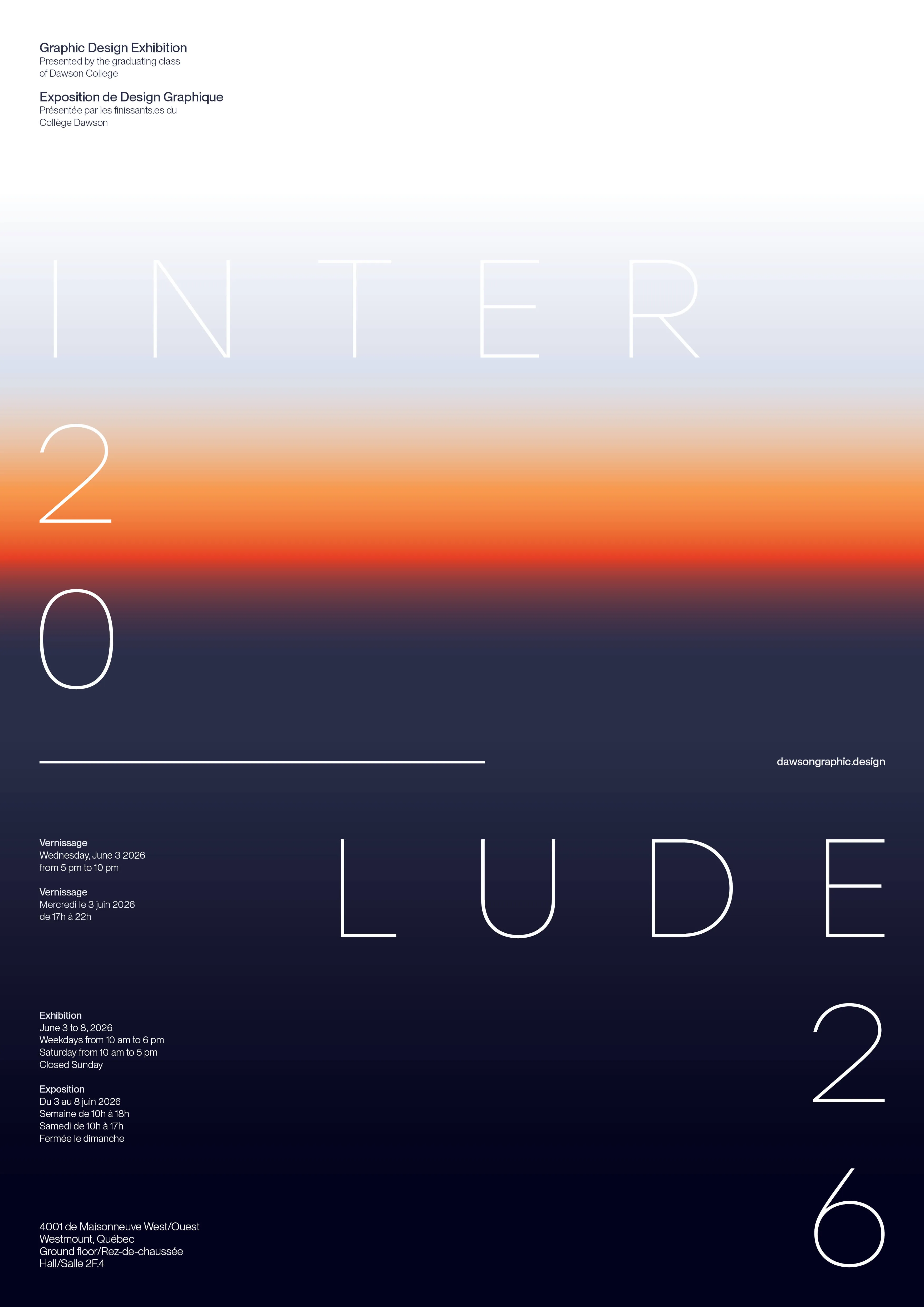
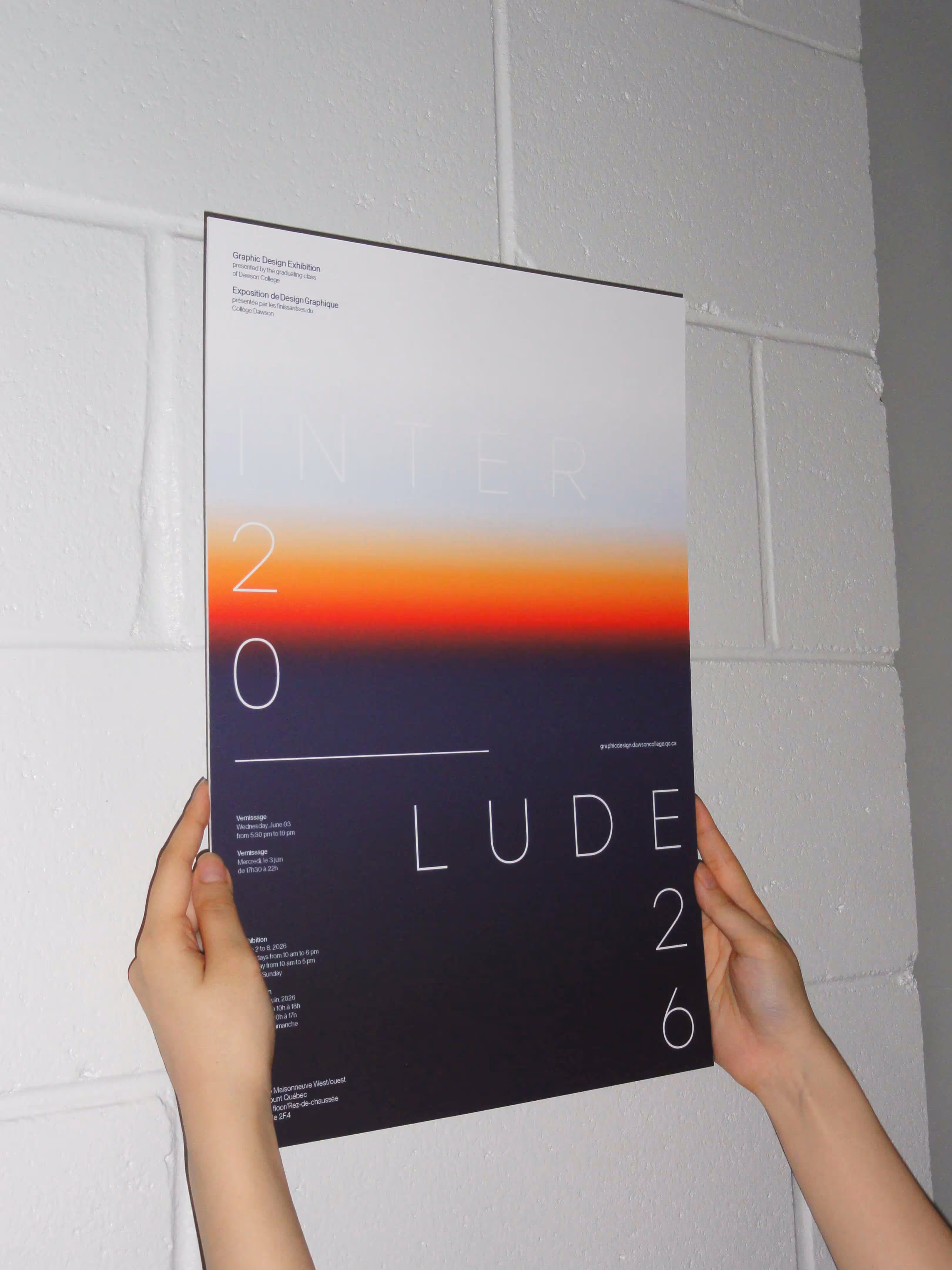
At first, my poster was titled 'After Hours,' referring to the time designers spend working after hours and how the vernissage takes place after our final semester. However, 'After Hours' felt too vague for an event title, so I settled on 'Interlude.'
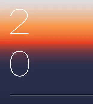
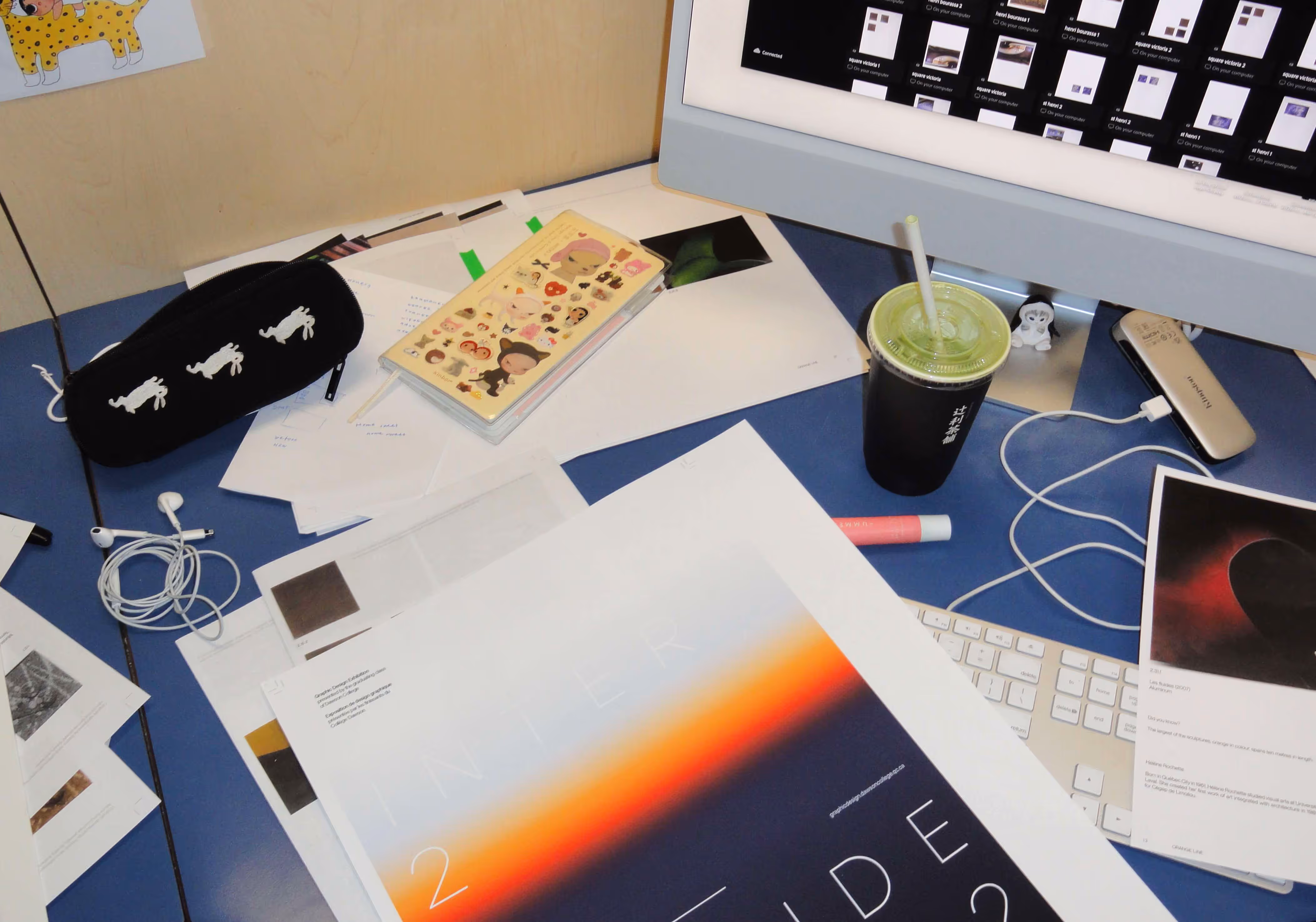
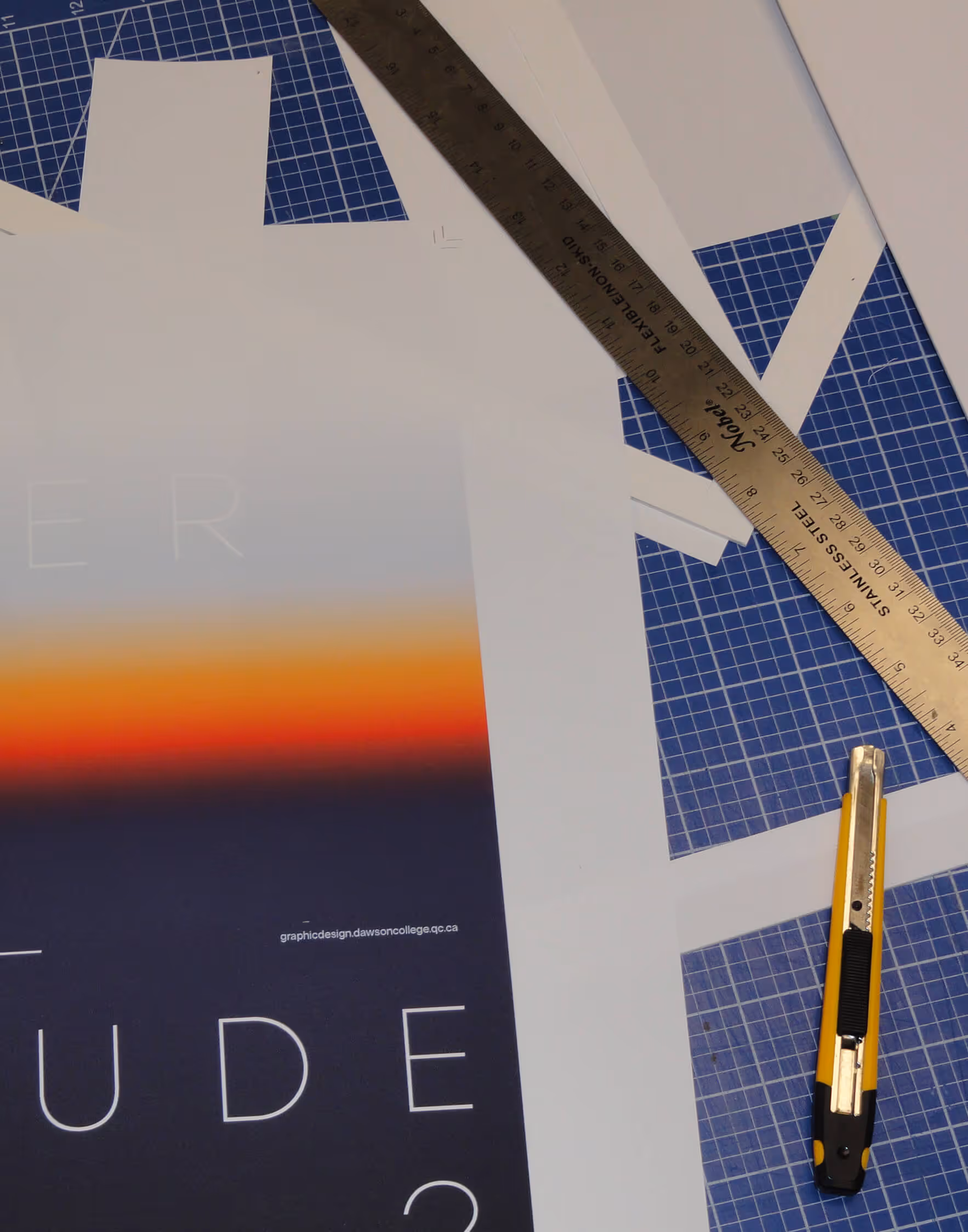
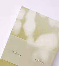
An interlude is a temporary pause or intervening period of time; it acts as a break, breather, or transition between events. I felt it suited our current phase in life while maintaining the visual essence of the passage of time. The poster features a sunset-like gradient background, and the word 'Interlude' is separated to create a sense of dynamism and is presented in a thin type weight for a refined, Suisse-inspired design.
credits
typeface
photography
Stolzl
Juliana Wu
Publication

Branding
Promotional
Publication

Wayfinding
Packaging